Should You Read This Book? "The Back of the Napkin: Solving Problems and Selling Ideas with Pictures"
According to Seth Godin, there are two scarce elements in our economy: trust and attention. I'm going to try and help with that by offering my trustworthy opinion on whether you should give your attention to this book by Dan Roam.If the title of the book, "The Back of the Napkin: Solving Problems and Selling Ideas with Pictures" doesn't immediately pique your interest, it might not be for you. It's pretty straightforward: this is a book about how to convey ideas with pictures.
So why should you trust my opinion? Because I'm on the internet! ...If that's not enough, a few weeks ago I was on a podcast where I interviewed a startup in the data visualization industry, so turning ideas into pictures is fresh on my mind. In my free time, I'm a photographer and a writer, and I suppose I've read a handful of other books with pictures. ("Charlotte's Web," "Sin City," and "The Farmer and the Clown," are some of my favorites.) I also recently read a book called "Drawing on the Right Side of the Brain" and loved it, so I have something to compare to this "Napkin" book.
With my street-cred squared away, should you give this book your attention? I read it to find out.Dan Roam is confident that anyone can use the "Napkin" methodology because everyone visually interprets the world around them six predictable ways, regardless of how they rate their artistic abilities. However, drawing skills aren't the most significant barrier to entry here. Roam also refers to himself as a "chart guy," and the lessons of the book are steeped in the language of business efficiency: how can a 100-page proposal turn into a six-slide presentation; what's going to keep someone reading a spreadsheet from falling asleep?If you're looking for musings on color theory or post-modernist composition, and don't care about how to illustrate "increases in revenues," "direct marketing approaches," or "influence in buying decisions," turn back now.
The Six Ways of Seeing and Showing
The central idea of "Back of the Napkin" is that human beings see the world using six predictable methods, and those six ways of seeing have direct corollaries in how ideas can be shown. When you look at something - anything - your brain makes a few instant calculations to determine what the thing is that you're looking at.
These instant visual calculations fall into six categories:
1) who/what
2) how many
3) where
4) when
5) how
6) why
These six categories of "seeing" directly correlate to six categories of "showing." To come up with a picture idea, one simply clarifies what is being seen, connects the "seeing" method to the "showing" method, and presto! A drawing idea is born.If I want to make a picture that explains What something is about, or Where it came from, I can use a standard process to decide what information to include in this picture that will most effectively express the meaning I want to convey.
SQVID
The book recommends a process called SQVID: each letter corresponds to a choice you will make when deciding how to visually represent an idea. After working through these choices, you'll be ready to draw. First, what "seeing" category does it fit into? Second, where on the SQVID does it land?
The S stands for Simple or Complex
The Q stands for Quality or Quantity
The V stands for Vision or Execution
The I stands for Individual or Comparison
The D stands for Change or As-is (D for Delta, the symbol of change)
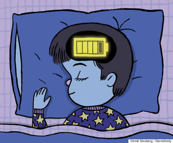


Say we want to visually convey an idea of children's sleep quality. We would decide where on the SQVID it falls - is this a simple or complex idea? Do we want to signify the quality of sleeping, with an included analogy to a recharging battery? Or provide a larger quantity of information, like the number of sleep hours and the inclusion of naps? Is it enough to show the individual case of one child, or should it be a comparison of age groups?Taking the SQVID questions into consideration, a "How Much sleep does a kid need?" drawing might look like this: Or it could end up looking like this, depending on the story that needs to be told:'The book continues on with examples for each of the "seeing" and "showing" techniques, all casually presented like they were dreamed up on a napkin. It also suggests that a visual idea can cross over into several 'showing' categories to clearly communicate the concept. For example, a 'How Much' drawing can join a "Where" drawing, becoming a map like this example.
So what's my take on all this?
There are interesting nuggets of information to be found here - particularly the breakdown of "six ways of seeing."I think even people who don't consider themselves artistic might find the suggested drawing methods come naturally to them after a bit of trial-and-error, but distilling the concepts into easy to remember devices like SQVID is helpful.In an attempt to keep things informal, unfortunately, the book leaves out some basic information for specific use cases. For example, one chapter uses an example of illustrating software documentation without mentioning that an entire "language" already exists for this very purpose. UML (Unified Modeling Language), is a standard approved by the International Standards Organization (ISO) and is widely used in software development.
People who consider themselves capital-A Artistic might not find great value here unless they're struggling with their TPS reports. Early in the book, the elementary idea that an apple could be represented visually in more than one way is expressed as though it would be an epiphany for the reader. I had to force myself to keep reading when it seemed that the rest of the book would continue to target that simple level of understanding.
There a few reasons you might want to might pick this book up. Maybe like me, you're interested in art and are looking for new ways to develop drawing skills. In that case, I would highly recommend "Drawing on the Right Side of the Brain" instead. On the other hand, those who don't consider themselves artistic but are looking for techniques for visualizing quantitative data would find more advanced concepts in the work of Edward Tufte.If you're somewhere in the middle, you could skim "The Back of the Napkin," read this blog post, pick up a dry-erase marker, and get to work on a whiteboard. *this post was written as an assignment for a digital marketing class